Dashboards Aren’t Just Data – They’re Experiences
2 Oct 2025

We’ve all seen dashboards that are technically correct but completely unusable.The numbers are there. The charts look fancy. But no one knows what they’re looking at, what action to take, or how to interpret it. So the dashboard gets ignored, and people go back to gut feel or spreadsheet exports.
At EdgeRed, we see this all the time – and it’s why we believe UX/UI should play a central role in dashboard design. Because if a dashboard isn’t usable, it doesn’t matter how accurate or powerful the data behind it is.
Why design matters in data

Dashboards are a user interface. They’re how people experience your data. And like any interface, they need to be intuitive, accessible, and purposeful.
Here’s what we prioritise when we design dashboards for our clients:
1. Clarity beats complexity
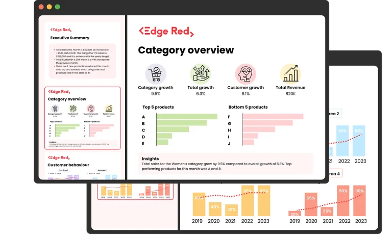
A clean layout with a clear headline metric is more powerful than a cluttered board full of gauges and gradients. People don’t need every metric – they need the right ones.
2. Hierarchy and flow matter
What do users need to see first? What questions are they trying to answer? A well-designed dashboard guides the eye naturally – from high-level summary to detailed breakdown.
3. Consistent filters, labels, and navigation
It sounds basic, but inconsistencies are one of the biggest adoption killers. We’ve seen dashboards where filters reset unexpectedly, time periods are unclear, or metrics are labelled differently across tabs. It confuses users – and undermines trust.
4. Design for the decision-maker
A dashboard isn’t just a data showcase – it’s a decision support tool. We always ask: who is using this, and what decision are they trying to make? The answer should shape everything from chart type to layout.
A few practical tips
If you’re building or refreshing dashboards, here are a few quick wins:
- Use whitespace and grouping to avoid visual overload
- Avoid too many chart types on one page
- Prioritise mobile/responsive layouts if people access reports on the go
- Include contextual info (e.g. metric definitions, last refresh time)
- Always test with real users – not just analysts
“Design is the difference between a dashboard that gets opened once and one that becomes part of daily decision-making. Good UX turns data from something people observe into something they act on.” – Monica Ly, Co-Founder at EdgeRed
Final thoughts
Good data is essential – but it’s not enough. If you want people to trust and use your dashboards, UX/UI can’t be an afterthought. It needs to be part of the process from day one.
At EdgeRed, we combine data engineering with product thinking – and that’s what turns dashboards from passive reports into tools that actually drive business decisions.
If you’re tired of dashboards that look good but go unused, let’s chat. A few small design changes might be all it takes to get your team re-engaged.
This blog is written by Monica, assisted by E.R.I.C.A.
About EdgeRed
EdgeRed is an Australian boutique consultancy with expert data analytics and AI consultants in Sydney and Melbourne. We help businesses turn data into insights, driving faster and smarter decisions. Our team specialises in the modern data stack, using tools like Snowflake, dbt, Databricks, and Power BI to deliver scalable, seamless solutions. Whether you need augmented resources or full-scale execution, we’re here to support your team and unlock real business value.
Subscribe to our newsletter to receive our latest data analysis and reports directly to your inbox.


