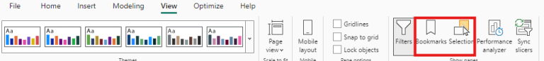
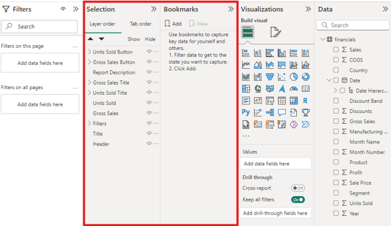
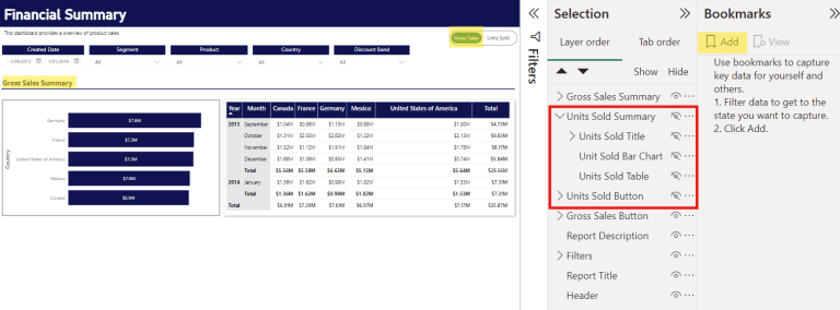
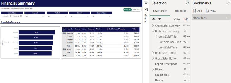
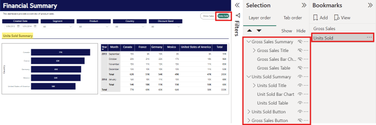
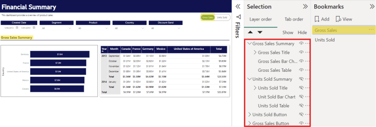
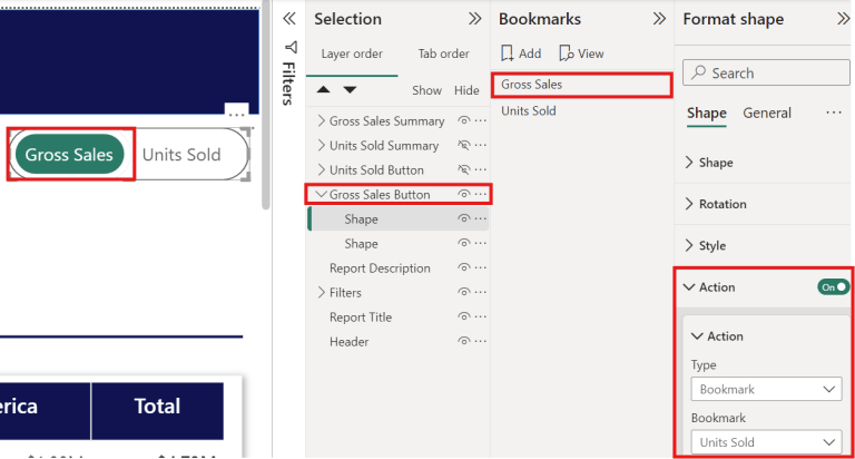
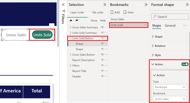
top of page

Enhance Power BI interactivity with toggle features

Edgered power bi

Struggling with cluttered reports trying to cater to diverse users? A simple solution is to add buttons that allow users to toggle between different visuals, displaying information relevant to their needs while maintaining a clean and navigable report.


An introduction to Power BI’s buttons and bookmarks


This post will guide you through creating a user-friendly Power BI report using buttons and bookmarks. These features enable you to manage the displayed charts and information dynamically, making your dashboard more intuitive and efficient.


Using buttons and bookmarks is an excellent way to save space on your dashboard and tailor visuals to specific use cases. For example, instead of having two separate sections in the report, you can layer visuals on top of each other and use buttons to switch between them. This way, you can display content based on the button clicked, consolidating everything into a single view.


In this tutorial, we'll use a report that includes two sections: one displaying total gross sales and the other showing units sold per period, both organised by year, month, and country. By using buttons and bookmarks, you’ll learn how to seamlessly toggle between these sections, enhancing the report's interactivity and usability.


Power BI report
Power BI Report Before


Power BI Report After


Setting this up is quite simple - let’s jump into it!


Step 1. Add a button


Add two buttons to the report for each section. You are able to change up the formatting of the button such as shape and colour in the Visualisations pane. There are also many ways to create and design a button, in this example, each button is made up of 2 shapes grouped together to look like a slider.


PowerBI toolbar / Visualisation Pane
Step 1a: Visualisation Pane
Power BI buttons
Step 1b: Slider Buttons

Step 2. Open the Selection and Bookmarks pane


The Selection pane allows you to hide or unhide selected visuals which is quite handy to have when creating bookmarks. It also allows you to rename the visuals you have on the report and group them together. 


Power BI Selection Pane
Step 2a: Selection Pane

Power BI Selection & Bookmarks Pane
Step 2b: Selection & Bookmarks Pane

Step 3. Stack up the buttons and tables


For a seamless transition between the sections and buttons, stack one perfectly above the other. 


Power BI Stack buttons and tables
Step 3: Stack the Buttons & Tables

Step 4. Hide visuals and add a bookmark


In this step, we will hide one table and one button by clicking on the eye icon in the Selection pane. As shown in the screenshot, we will first hide the Units Sold table and button to show the Gross Sales part of the report. Add a bookmark to save the current state of the report. You can also rename the bookmark for easy identification!


Power BI hide visuals
Step 4a: Hide Visuals

Power BI Add and rename bookmark
Step 4b: Add & Rename the Bookmark

Step 5. Unhide visuals and repeat Step 4


Now that we have one state of the report bookmarked, we can move on to the next one. Unhide the visuals related to the previous bookmark, hide the ones for the next, and add another bookmark.


Power BI Unhide / hide visuals
Step 5a: Unhide / Hide Visuals

Power BI Bookmark visuals
Step 5b: Add and Rename the New Bookmarks

For Units Sold, we have hidden the Gross Sales-related visuals and vice versa for Gross Sales. 


Step 6. Add action to buttons


Select a bookmark and the button that is currently visible, then add an action to make the button interactive. As we have created some bookmarks in the previous steps, we can direct the button to the bookmark. Select ‘Bookmark’ for Type and select the bookmark for the other state of the report for the button, that is, Gross Sales should switch to Units Sold when clicked. Similarly, do this for the Units Sold button too!


Power BI Add Action Buttons
Step 6: Add Action Buttons

Power bi Add Another Action Button
Step 6b: Add Another Action Button

Step 6c: Bookmarked Buttons


Power BI report before
Power BI Report - Before

Power BI Report - After


Closing remarks


By leveraging Power BI’s buttons and bookmarks, you can significantly enhance the interactivity and user experience of your reports. This approach not only helps in decluttering your dashboard but also allows you to present information in a more organised and contextually relevant manner. 


We hope this guide empowers you to create more dynamic and user-friendly reports, tailored to meet the diverse needs of your audience. 


Frequently Asked Questions (FAQs)

Can I use multiple bookmarks within the same Power BI report?

Yes, you can create multiple bookmarks in a single Power BI report to manage different views or states of your visuals. Each bookmark can be linked to a specific button, allowing users to toggle between various sections of the report seamlessly.

How do I ensure that my buttons work correctly across all devices?

Is there a limit to the number of visuals I can hide or unhide using bookmarks in Power BI?


This post was written by Shirlyn, with support from Natasha and Erica. 


About the author

Shirlyn is a Consultant with a background in Mathematics and Applied Statistics. She excels in data wrangling, exploratory data analysis, and creating interactive data visualisations, making her a proactive problem solver who delivers user-friendly solutions. As our resident data visualisation expert, she holds a Power BI certification and has experience across various industries, including logistics, recycling, and financial institutions. In her spare time, Shirlyn enjoys watching The Big Bang Theory and The Office on repeat. 


Subscribe to our newsletter to receive our latest data analysis and reports directly to your inbox.


Comentarios


bottom of page