Choosing the right data visualisation tool: Power BI vs Tableau vs Google Looker Studio?
10 May 2023

In the realm of data analytics, visualisation tools are indispensable for turning complex data into actionable insights. At EdgeRed, we’ve leveraged the strengths of Power BI, Tableau, and Google Looker to serve our clients’ unique needs.
Here’s a brief overview of how each has added value, along with their pros and cons, and considerations for selecting the right tool for your visualisation tasks.
Power BI
Power BI is a robust analytics platform that offers comprehensive capabilities for data manipulation and report generation. Our use of Power BI has been transformative for clients who require deep integration with existing Microsoft ecosystems. Its native connectivity to various data sources and Azure services makes it a powerhouse for those already invested in Microsoft products.

We’ve utilised Power BI for a project that required the development of standardised metrics and insights suitable for different clients. We engineered a template that mimicked a PDF’s look and feel and built automated data models and calculations within Power BI dashboards. This approach saved the equivalent of 1 full-time dedicated analyst’s effort, which was then redirected to other strategic activities.
Pros:
Seamless integration with Microsoft products.
Cost-effective for small to medium-sized enterprises with existing Microsoft licenses.
User-friendly interface and rich set of visualisation options.
Continuous improvements and release of new features.
Provides advanced security features, ensuring data protection and compliance with regulatory standards.
Well-suited for scaling operations and handling large datasets, making it a reliable choice for growing businesses.
Cons:
Report publishing primarily limited to the Power BI service, which requires a license.
Data modelling capabilities can be more complex compared to other tools.
While user-friendly, mastering advanced features may require additional training.
Considerations:
Your current IT infrastructure and compatibility with Microsoft products.
The scale of deployment and licensing costs.
Tableau
Tableau excels in creating visually appealing, interactive dashboards. It’s been our go-to choice for clients needing advanced visual analytics. With Tableau, we’ve consolidated extensive reports into intuitive dashboards that facilitate quicker decision-making.

Our proficiency with Tableau was exemplified when we streamlined the operations and marketing teams’ workflows for a client. By conducting a series of workshops and interviews across the business, we reduced the number of reports from over a hundred to just three automated Tableau dashboards. These dashboards provided near real-time reporting capabilities and a consistent source of truth, saving significant time for analysts and enabling quick, informed decisions across the business.
Pros:
Highly intuitive and interactive visualisations.
Strong data connectivity and blending capabilities.
Offers extensive connectivity to a wide range of data sources, facilitating flexibility in data integration.
Known for its superior visualisation capabilities, enabling the creation of complex and aesthetically pleasing dashboards.
Large, active community for support and inspiration.
Easy to pick up, requiring less technical skills.
Cons:
Higher cost can be a barrier for some organisations.
Initial learning curve perceived as steep for more complex functionalities.
Large datasets and complex visualisations may require significant computing resources.
Considerations:
The level of interactivity and visual complexity required.
Budget allocation for visualisation tools.
Google Looker Studio
Google Looker Studio has been instrumental for clients who prioritise web-based data exploration and integration with Google Cloud Services. Its data modelling language, LookML, allows for extensive customisation and scalable analytics.

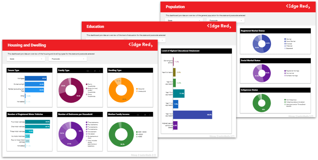
We’ve used Looker to develop interactive dashboards, including a public case study that provides an overview of the most recent census data across Australia. This Looker-based solution leveraged its strong integration with Google Cloud Services, including BigQuery, to process and visualise large datasets efficiently.
Pros:
Deep integration with Google Cloud Platform and BigQuery.
Real-time data access with strong web-based exploration capabilities.
Advanced customisation through LookML.
Supports a collaborative workflow, allowing multiple users to work on the same model simultaneously.
Cons:
Requires expertise in LookML for custom modelling.
May not be as widely adopted as Power BI or Tableau, potentially affecting resource availability.
Considerations:
The extent to which your organisation is invested in the Google Cloud ecosystem.
The need for customisable and scalable business intelligence solutions.
When selecting the right visualisation tool, it’s essential to consider your organisation’s specific needs, existing infrastructure, resource skill set, and the kind of visualisation capabilities that will best communicate your data’s story. Each of these tools offers unique advantages, and the best choice often depends on the context in which it will be used.
At EdgeRed, we understand these nuances and work with our clients to implement the solution that best fits their strategic objectives, empowering them to harness the full potential of their da
About EdgeRed
EdgeRed is an Australian boutique consultancy specialising in data and analytics. We draw value and insights through data science and artificial intelligence to help companies make faster and smarter decisions.
Subscribe to our newsletter to receive our latest data analysis and reports directly to your inbox.


