Building with open data: Making Melbourne’s transport network explorable
18 Feb 2026
What can you build with a CSV file, some Python, and a freely available map dataset? More than you might think.
As of 1st January 2026, anyone under 18 can travel free on Melbourne’s trains, trams, and buses. It’s a brilliant policy for accessibility and equity, but how many young people actually know where they can go? The train network is often seen as a way to get to school or the CBD, not as a gateway to discovering hidden gems across the city.
That’s a data visualisation problem waiting to be solved.
The building blocks: Open data everywhere
Victoria’s open data landscape is remarkably rich. Public Transport Victoria publishes detailed station data as CSV files and GeoJSON. OpenStreetMap, a collaborative mapping project maintained by volunteers worldwide, contains millions of points of interest: cafes, restaurants, parks, cinemas, and countless other venues. Put them together with modern tools like React and Python, and you can create something genuinely useful.
From Data to Discovery: The Technical Approach
The core question is simple: given a train station, what’s within walking distance? But a circular buffer doesn’t reflect reality. You can’t walk through buildings or across train tracks, you follow streets, footpaths, and laneways.
This is where isochrones come in. An isochrone shows everywhere you can reach within a specific time by following actual walkable routes. Instead of “what’s within 1 kilometre as the crow flies?”, you’re asking “what can I actually walk to in 15 minutes?“
OSMnx, a Python library designed for OpenStreetMap street networks, makes this possible:
The result is far more accurate. A station next to a freeway might have excellent access to one side but limited access to the other. This matters for young people planning journeys from an accessibility and safety point of view.
A Real Example: Northcote Station and CERES
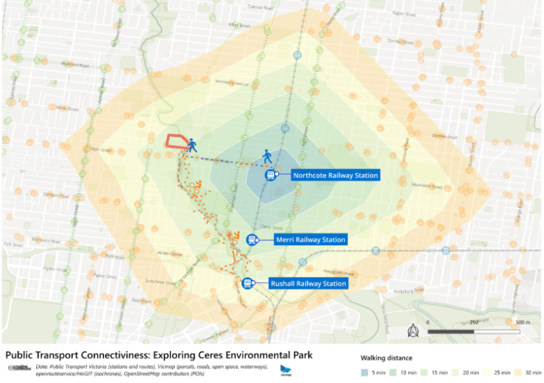
Take CERES Environmental Park, one of Melbourne’s best-kept secrets. This 4.5-hectare urban farm sits on a former rubbish dump between several train stations. Free entry. Urban gardens, 200 chickens, 10,000 bees, workshops, weekend markets, and events like “Weed Dating” (speed dating whilst gardening).
For a young person exploring Melbourne, this is gold. You have options:
- Northcote Station: 10-15 minute direct walk to CERES
- Rushall Station: 15-20 minute scenic walk along the Merri Creek Trail
Both routes are straightforward, safe, and completely free. The Merri Creek Trail continues for kilometres in both directions, offering even more exploration opportunities.
This is what the data reveals when you visualise it properly: every station is a portal to somewhere interesting, and often multiple stations can get you there via different routes. Knowing your options makes the city infinitely more accessible.
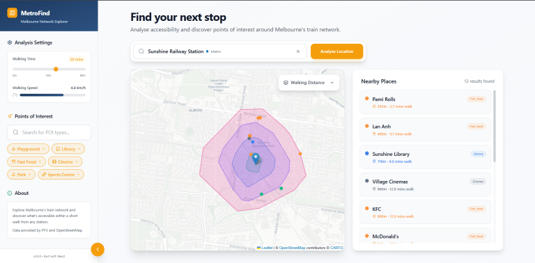
Making It Visual and Fun
Data visualisation is about engagement. The interface needs to feel like discovery:
- Search functionality to find stations quickly
- Adjustable walking time sliders
- Category filters for different venue types
- Interactive map with immediate visual feedback
- Results showing walking times and ratings
Tools like Magic Patterns enable rapid prototyping, while React’s component based architecture lets you develop each piece independently before composing them into a cohesive whole.
The result: building web application with open data, react and python
Safety and Independence Through Information
There’s an underappreciated aspect of tools like this: they make travel safer and less intimidating. Young people with access to clear information about what’s near a station can:
- Plan journeys with confidence, knowing what to expect at their destination
- Choose well-lit, busy areas with cafes and shops rather than isolated spots
- Identify landmarks near their destination to help with navigation
- Make informed decisions about where to meet friends
- Feel more comfortable exploring unfamiliar suburbs
The tool doesn’t create safety, but it does create informed decision-making, which is a key component of safe, independent travel.
What Else Could You Build?
The same approach combining transport data with OpenStreetMap opens up possibilities:
- Employment Accessibility Maps
Cross-reference job postings with public transport access. Show people without cars which employment areas they can realistically reach within an hour’s commute.
- Healthcare Access Visualisations
Map GP clinics, dental practices, and hospitals relative to train stations. Identify suburbs where healthcare access via public transport is limited.
- Educational Opportunity Mapping
Show which universities, TAFEs, and training centres are accessible from different suburbs. Help students understand their options without assuming car ownership.
- Cultural Event Discovery
Integrate event data with transport accessibility. Show which galleries, theatres, or music venues are reachable from different parts of the network.
- Disability Access Analysis
Combine accessibility data (ramps, elevators, accessible toilets) with transport routes to help people with mobility needs plan journeys.
- Environmental Impact Studies
Analyse how improved transport connectivity correlates with reduced car dependency in different suburbs.
The key is that all the building blocks are freely available. You don’t need expensive proprietary datasets or enterprise software licences. Just curiosity and time to learn the tools.
Getting Started With Open Transport Data
If you’re interested in building something similar, here’s where to start:
Data Sources
- Public Transport Victoria: Data.vic.gov.au hosts datasets on patronage, station locations, and timetables
- OpenStreetMap: Download Australian extracts from GeoFabrik or use the Overpass API for specific queries
- Australian Bureau of Statistics: Census data on population, demographics, and transport usage
- Local councils: Many publish their own open datasets on facilities, events, and services
Tools and Libraries
- Python: Pandas for data manipulation, GeoPandas for spatial operations, OSMnx for network analysis and isochrones
- JavaScript: Leaflet or Mapbox for interactive web maps, React for building interfaces
- QGIS: Free desktop GIS software for exploring and visualising spatial data
- Magic Patterns: Rapid prototyping of UI components and layouts
OSMnx deserves special mention. Developed by Geoff Boeing, it makes network analysis accessible to anyone comfortable with Python. What would have required expensive GIS software and complex workflows a decade ago can now be done in a few lines of code.
The Broader Picture: Open Data as Public Infrastructure
Transport data isn’t just numbers in spreadsheets. It’s a representation of how cities function, how people move, and what opportunities are accessible to different communities.
When this data is open, it becomes public infrastructure that anyone can build on. A teenager can create a side project. A researcher can analyse transport equity. A community organisation can identify service gaps. A startup can build a commercial application.
Open data democratises the ability to understand, question, and improve how cities work.
Your Turn
Victoria’s data is out there waiting. The tools to work with it are free and increasingly accessible. The only question is: what will you build?
Maybe it’s something to help young people explore safely. Maybe it’s a tool for jobseekers to find accessible employment. Maybe it’s a way to visualise how transport shapes neighbourhood character. Maybe it’s something no one has thought of yet.
The beautiful thing about open data is that you don’t need permission to experiment. Download a dataset, fire up Python or QGIS, and see what you can discover. Start small, iterate often, and share what you learn.
The train network isn’t just infrastructure. It’s data, waiting to tell stories about how a city connects its people to opportunities. What story will you tell?
This blog was written by Nhung.
About EdgeRed
EdgeRed is an Australian boutique consultancy with expert data analytics and AI consultants in Sydney and Melbourne. We help businesses turn data into insights, driving faster and smarter decisions. Our team specialises in the modern data stack, using tools like Snowflake, dbt, Databricks, and Power BI to deliver scalable, seamless solutions. Whether you need augmented resources or full-scale execution, we’re here to support your team and unlock real business value.
Subscribe to our newsletter to receive our latest data analysis and reports directly to your inbox.