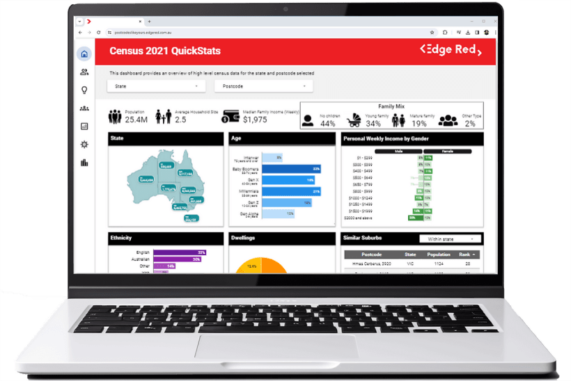
Transforming the Australian Census 2021 data through visual analytics and Google Looker Studio
16 Apr 2022

Live demo: access our interactive online dashboard here!
The Australian Census stands as an invaluable treasure trove, offering a profound glimpse into the heartbeat of our nation. This vital dataset not only captures the intricacies of demographics, housing dynamics, and societal shifts but also serves as a unique window into aspects of Australian life that we might otherwise miss.
Conducted every five years by the Australian Bureau of Statistics (ABS), the 2021 Census became a vital undertaking, reflecting the nuanced changes in our nation during a period of unprecedented challenges and transformations.
Understanding the Australian Census 2021
As we delve into the Australian Census 2021, it’s important to note that it not just as a statistical ritual but as a narrative capturing the heartbeat of our population. The 2021 Census, conducted amidst the challenges of the COVID-19 pandemic, offers a unique perspective into the changed circumstances of many Australians. With various parts of Australia under lockdown and strict movement controls, the Census results unveil the impact of the pandemic on populations across cities, towns, rural, and remote areas.
These unprecedented times introduced complexities in the Census data collection and processing. The movement restrictions and access challenges caused by the pandemic necessitated meticulous preparations by the Australian Bureau of Statistics (ABS) to ensure the successful enumeration of the Census. Large parts of southeastern Australia were experiencing COVID-19 restrictions, adding an extra layer of intricacy to an already intricate process.
Navigating the ABS Quick Stats
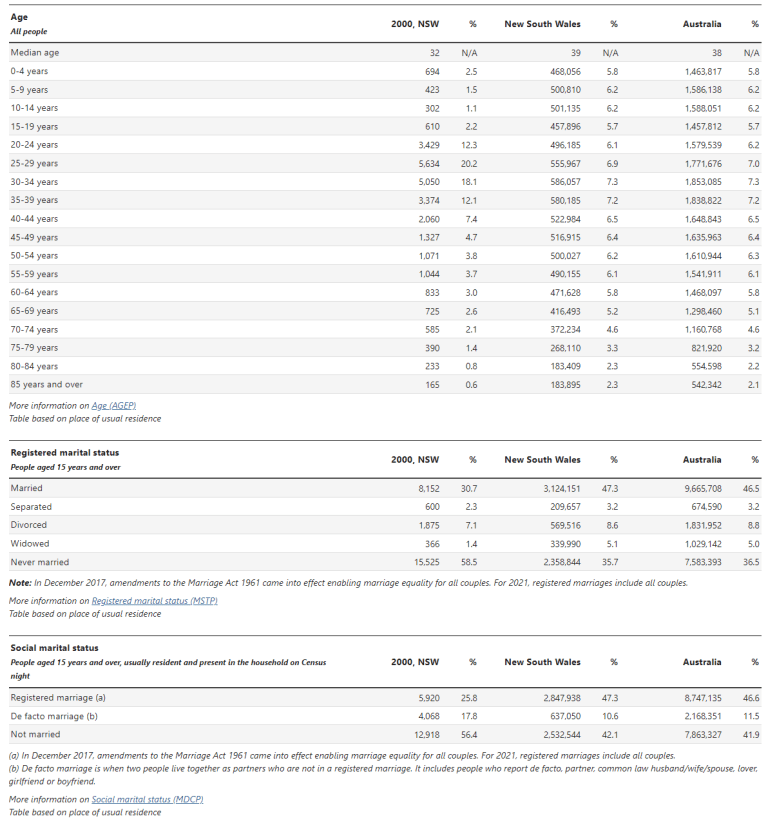
The ABS Quick Stats is undoubtedly a valuable resource for people seeking to access the Census data, however it is usually structured in a data-heavy and tabular format. While this approach undoubtedly provides a comprehensive breakdown of details, it can occasionally feel like deciphering a map in a foreign language for individuals seeking a quick and intuitive understanding of the Census insights.
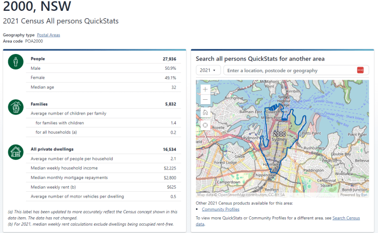
In acknowledgment of this potential hurdle, our case study embarks on a mission to not merely translate this tabular treasure trove but to reimagine its presentation entirely. Visual analytics becomes our lens, transforming what might appear as a dense forest of data tables into a captivating panorama. Our aim is not just to make Census data accessible but to make it a visual feast that effortlessly tells a story, removing barriers and providing an inviting pathway for individuals to engage with the rich insights hidden within the data.
Introducing Google Looker Studio
Google Looker transcends the conventional bounds of data analytics, presenting a transformative shift in how we approach and extract insights from data. Beyond being a tool, Looker Studio becomes an immersive journey, providing a seamless interface that empowers users, whether seasoned analysts or newcomers, to explore and visualise data effortlessly. Its intuitive design breaks down complexity, making data exploration accessible, while rich visualisation capabilities and powerful analytics tools turn raw datasets into vibrant narratives, fostering informed decision-making.
In the realm of dynamic data exploration, Google Looker Studio is not just a platform but a trusted partner, unveiling stories hidden within datasets. Its user-friendly interface, coupled with advanced analytics, positions Looker as a catalyst for turning information into actionable insights. Every dataset becomes a narrative waiting to be unfolded, setting the stage for a new era of discovery where Looker becomes the key to unlocking the full potential of your data.
Crafting Census Visual with Google Looker Studio
Enter the realm of our Google Looker dashboard, where raw Census data undergoes a transformation into a vibrant visual narrative. Our visual analytics approach seeks not just to present but to bring the Census findings to life, offering a nuanced understanding that transcends traditional data presentations. The Google Looker dashboard becomes more than a tool; it’s a gateway to a visual journey, unveiling intricate details and nuanced patterns embedded in the Australian Census 2021.
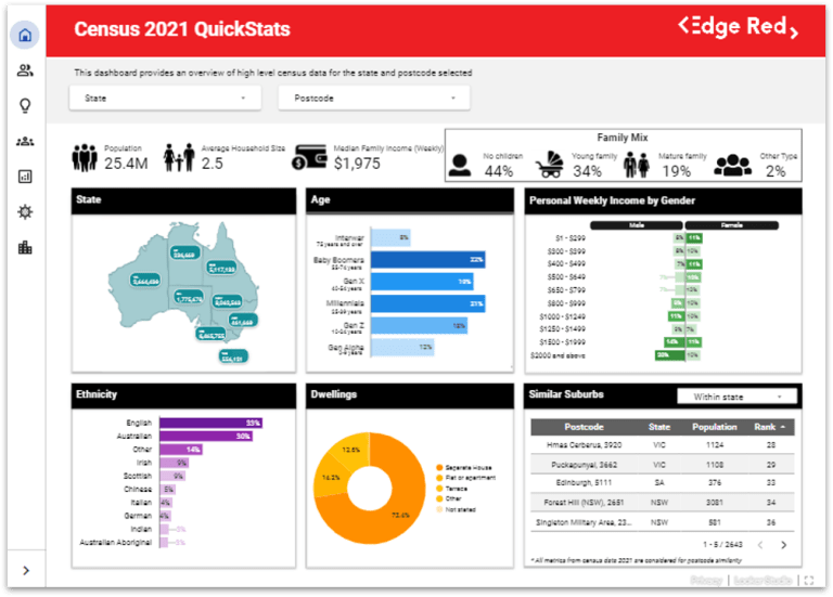
Visual analytics becomes the heart of our approach. By distilling complex Census data into engaging visualisations, we aim to make the insights easily accessible, engaging, and relatable to a broader audience. Our goal is to transform Census data from mere statistics into a visual story that resonates with individuals, communities, and organisations alike.
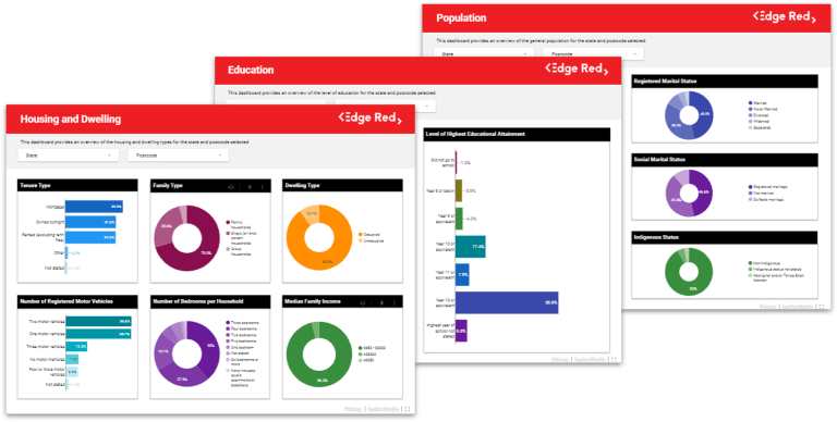
Our case study is an invitation to witness the transformation of Census statistics into stories. Step into a realm where every number carries a tale, and as we navigate through the Australian Census 2021, we endeavour to redefine how we perceive and interact with the wealth of data that shapes our nation. Beyond the data tables and figures lies a narrative waiting to be unveiled – a story about Australia, its people, and the unique insights encapsulated in the Census 2021 data.
About EdgeRed
EdgeRed is an Australian boutique consultancy specialising in data and analytics. We draw value and insights through data science and artificial intelligence to help companies make faster and smarter decisions.
Subscribe to our newsletter to receive our latest data analysis and reports directly to your inbox.

