Tips to improve your Tableau Dashboard
performance
(part 3)
17 Sep 2024

In the earlier parts of this series, we tackled the essentials and intermediate tips to give your Tableau dashboards a performance boost. Now, in Part 3, we’re diving into the advanced stuff – like optimising calculations, trimming down those marks, and tidying up your workbooks. These final touches will help you fine-tune your dashboards and keep them running at their best.
Tip 1. Optimise calculations
To optimise calculations in Tableau and improve performance, consider the following tips:
Tip 1: Precompute values where possible to reduce computation time during dashboard interactions.
Tip 2: Use aggregation when possible.

Tip 3: Avoid using a calculated field multiple times within another calculation. For examples and solutions, refer to the Tableau documentation at the following link.
Tip 4: Use the COUNTD aggregation sparingly.
Tip 5: Use NOW() only when you require the timestamp level of detail. For date evel calculations, use TODAY() instead.
Tip 6: Strings and dates are slow, numbers and Booleans are fast.

Tip 2. Reduce the marks
In Tableau, “marks” refer to the visual elements in a view that represent data points. These can include bars, lines, shapes, text, or other graphical representations that display data on your charts or graphs. Each mark corresponds to a single data point or aggregated set of data points, depending on how your view is configured.
Most charts typically don’t have a large number of marks. On average, a visualisation might contain a few hundred marks or fewer, which Tableau can handle easily. To check the number of marks in your visualisation, simply look at the bottom left corner of your worksheet in Tableau Desktop, where the count of marks is displayed.
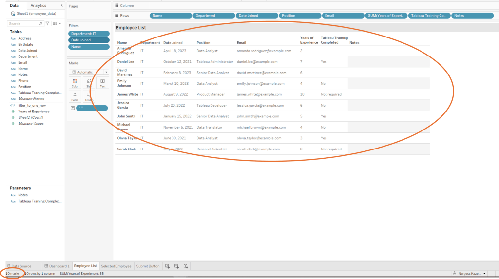
Here are a few strategies to reduce marks:
Aggregate Data: Use aggregation to summarise data rather than displaying every individual data point. For example, instead of showing each transaction, aggregate sales data by month or region.
Use Filters: Apply filters to limit the data shown to only what’s necessary for the analysis, reducing the number of marks in the view.
Simplify Visualisations: Choose visualisations that convey the essential information without excessive detail. For instance, use summary charts or dashboards that highlight key metrics rather than showing every single data point.
Tip 3. Clean up your workbook periodically
Remove unused fields and sheets from the dashboard to streamline the workbook size and improve load times.
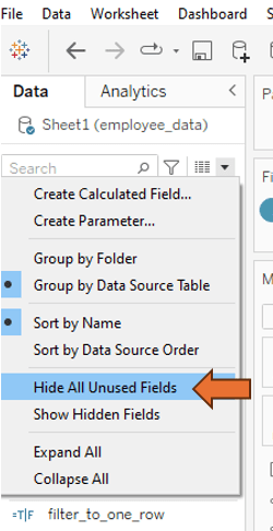
One way to identify unused columns is by running the optimiser. Click on ‘Server’ and then select ‘Run Optimizer…’. If there are any unused fields, they will appear in the first section of the optimiser results. For instance, in this example, fields like Address, Birthdate, Phone, Sheet1, and filter_to_one_row are identified as unused.
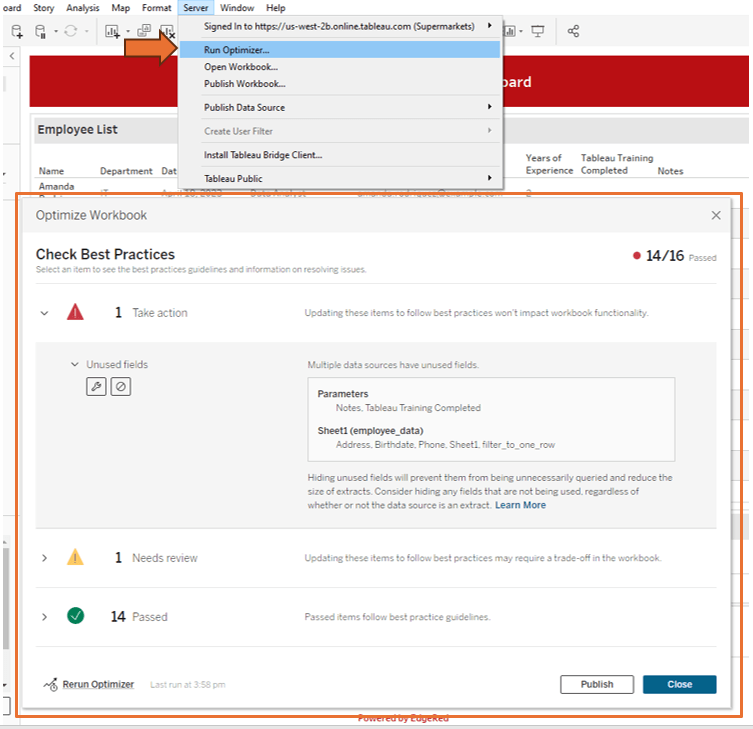
You have the option to delete unused columns from the data source or Tableau, or you can choose to hide unused fields to prevent them from being unnecessarily queried.
Tip 4. Use performance recording
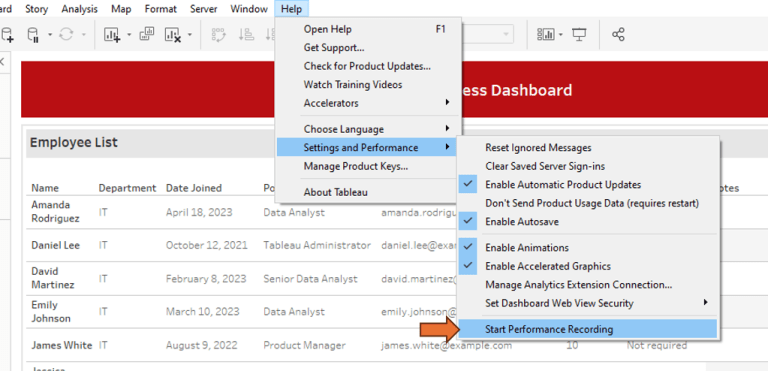
Tableau’s Performance Recording feature helps identify specific areas where dashboard performance can be optimised. Use it to analyse load times, query performance, and rendering times to pinpoint bottlenecks.
Click on Help, then go to Settings and Performance, and select Start Performance Recording. Next, interact with the dashboard, and when finished, stop the recording in the same menu. This will automatically open a Performance report.
Here is a link to Tableau’s guide on how to interpret a performance report.
Final remarks
Optimisation is a never-ending adventure, especially as your data grows and your analytical needs shift. By embracing these advanced techniques and keeping a close eye on your dashboards, you’ll keep them running smoothly, efficiently, and ready to deliver those game-changing insights.
We hope our 3-part series has been a treasure trove of tips and tricks, setting you up to build high-performing Tableau dashboards that boost decision-making without skimping on speed or user experience.
Happy dashboarding! 🚀
Catch up on our other parts:
This post was written by Nargess.
About the author
Nargess Kazemi is a seasoned data visualisation expert with a Master’s degree in Artificial Intelligence and a Bachelor’s degree in Mathematics. With her fine attention to detail and a penchant for crafting creative technical solutions, Nargess has been instrumental in developing robust algorithms and effective data visualisation dashboards that have been widely recognised and utilised by businesses. Her expertise in SQL, Python, and various data visualisation tools has contributed significantly to the success of our clients’ projects. When Nargess isn’t delving into data, she enjoys sharing her knowledge and mentoring fellow team members to foster a rich environment of learning and innovation at EdgeRed.
About EdgeRed
EdgeRed is an Australian boutique consultancy with expert data analytics and AI consultants in Sydney and Melbourne. We help businesses turn data into insights, driving faster and smarter decisions. Our team specialises in the modern data stack, using tools like Snowflake, dbt, Databricks, and Power BI to deliver scalable, seamless solutions. Whether you need augmented resources or full-scale execution, we’re here to support your team and unlock real business value.
Subscribe to our newsletter to receive our latest data analysis and reports directly to your inbox.

